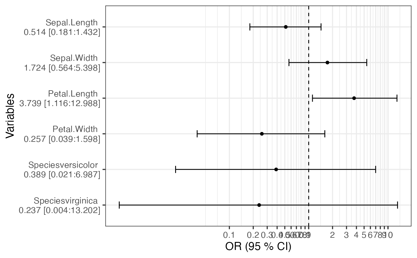
Heavily inspired by https://www.r-bloggers.com/plotting-odds-ratios-aka-a-forrestplot-with-ggplot2/
Usage
plot_olr(
  x,
  title = NULL,
  dec = 3,
  lbls = NULL,
  hori = "OR (95 % CI)",
  vert = "Variables",
  short = FALSE,
  input = c("model", "df")
)
Arguments
- x
input data.
- title
plot title
- dec
decimals for labels
- lbls
labels for variable names. Careful, as the right order is not checked automatically!
- hori
labels the horizontal axis (this i the y axis as the plot is rotated)
- vert
labels the horizontal axis (this i the x axis as the plot is rotated)
- short
flag to half number of ticks on horizontal axis.
- input
can be either "model", which is a olr model (polr()), or "df", which is a data frame with three columns for OR, lower CI and upper CI.
